
- August 5, 2025
- 0 Comments
- By admin
Building Trust Through Visual Identity
1. Why Visual Identity Matters
Your brand’s visual identity is more than just aesthetics. It’s your company’s first impression, your handshake, and the silent communicator of your values. In the digital marketplace, trust is currency. A cohesive, professional design communicates credibility, attention to detail, and consistency, qualities every customer seeks.
Think about how you judge a business: A cluttered website or inconsistent logo often raises red flags. On the flip side, clean design and consistent visuals signal professionalism and reliability.
2. Color Psychology in Branding
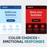
Colors are emotional triggers. They influence perception, behavior, and decisions. For example:
- Blue suggests trust, stability, and calm. It’s why banks and tech firms often use it.
- Red creates urgency, passion, or excitement. Great for clearance sales or bold brands.
- Green evokes harmony, nature, and health, ideal for wellness and eco-conscious brands.
- Black and gold communicate luxury and exclusivity.
By understanding color psychology, brands can intentionally shape how customers feel and act.
3. Logo Placement & Consistency
Your logo isn’t just a mark, it’s your anchor. Consistent placement (usually top-left on websites), proportional scaling, and usage across all platforms (from email signatures to social posts) help create familiarity.
Consistency breeds trust. When users repeatedly see your logo, fonts, and color palette applied uniformly, it reinforces your brand’s presence and professionalism.


4. Examples of Trust-Building Designs
- Apple: Minimalist design, sleek product visuals, and lots of white space give an aura of innovation and premium quality.
- Airbnb: Soft pastels and rounded fonts create a sense of warmth, safety, and human connection.
- Slack: Bright, cheerful colors combined with simple layouts make the platform feel intuitive and non-intimidating.
These brands don’t just look good; they look trustworthy.
5. Design Tips That Improve Conversion
Want your design to do more than just look pretty? Try these:
- Use clear hierarchy (large headlines, bold CTAs)
- Apply white space generously to reduce cognitive load
- Make sure buttons and links are easy to identify and click
- Use authentic imagery over cheesy stock photos
- Ensure your site is mobile-friendly and fast-loading
All of these build user trust, which boosts conversion.
6. Call to Action: Ready for a Brand Refresh?
Your visual identity is either building trust or eroding it. Want to find out which? We offer brand audits, identity revamps, and full-service design to help you make a stronger impression that converts.


Leave a comment